Economic data are volatile, both because human activity is dynamic and economic activity is difficult to measure. You’d think that investment professionals on Wall Street would understand this better than most people. But their demand for precise forecasts inevitably leads to disappointment — literally. Every week, Wall Street seems surprised by this indicator or that not matching “expectations.” But the bigger surprise might be just how consistent the U.S. economic recovery has been: By some measures, volatility is lower than typical.
The financial press doesn’t help, consistently hyping every new report of “bad” news. Last month it was the job report. In prior months we saw “disappointing” manufacturing reports, “concern” about cooling in the housing markets and “puzzling” slower consumer spending. Mind you, in all of these cases, we were experiencing not an absolute decline but a fall in the rate of increase. No doubt, some of these could prove to be troubling developments — if they continue and magnify. But too often the data are presented as damningly negative without sufficient context.
“Disappointing” jobs report
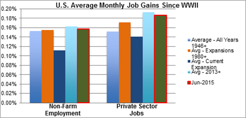
Take that bad jobs report: The U.S. added 223,000 jobs in June, according to the Bureau of Labor Statistics (BLS). And yet almost every major paper concluded that the report was “disappointing”? And why? First, the figure came in slightly below “expectations” of 230,000 — a miss of 3 percent. We should celebrate heartily if economists could reliably forecast every indicator within 3 percent, but that’s another story … On a percentage basis, 223,000 jobs essentially matches the post-WWII monthly average, the average of all expansion months in the last 35 years and the average monthly gain over the past two and a half years — and well above the average for this expansion. The private sector gains were even better, both absolutely and relative to historical norms. Moreover, the unemployment rate at 5.3 percent is 50 basis points below its post-WWII average. So, pretty good — from just about any comparison.
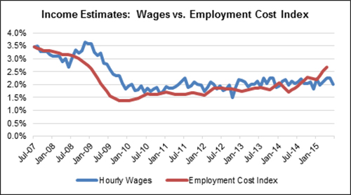
Second, some people pointed to the flat hourly wages, which are still struggling to get over the 2 percent level (shown in blue), just barely ahead of inflation, where it’s been stuck ever since we emerged since the recession. It’s hard to reconcile this with the large drop in unemployment, which is now at a seven-year low.
However, economists often prefer a different measure of wages known as the Employment Cost Index or ECI, shown in red. Unlike average hourly earnings, the ECI controls for compositional shifts in the labor force, which allows for more meaningful historical comparisons. Part of the problem is that we’ve been adding more lower-paying jobs, which brings down the hourly rate (which is calculated based on total wages in the economy divided by total hours worked). However, if we control for job types, the wage index actually has been growing fairly consistently, if slowly, since late 2009. By this measure we see growing wage gains for workers.
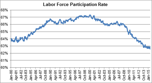
And third, the BLS reported that the labor force participation rate fell again. Thus, the improvement in the unemployment rate down to 5.3 percent was at least partly attributable to fewer people looking for work. Here the disappointment is perhaps more justified. The participation rate fell to a near 40-year low of 62.6 percent, though this downward trend has continued largely unabated since participation peaked in 2000 and primarily reflects structural factors, especially retirements from aging baby boomers and rising college attendance rates from millennials rather than cyclical weakness per se.
Falling participation ultimately reduces our economic growth — a worrying trend. But it’s hardly new nor the drop significant: The participation rate is essentially the same rate as a year ago. So, it would not seem to be newsworthy in and of itself. In fact, the bigger story might (should?) be how, after more than a decade of declines, the participation rate has largely stabilized since early 2014 as the job market has strengthened.
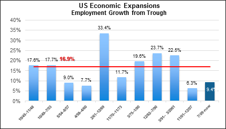
Finally, it may be pointed out that job growth through the entire recovery has been “disappointing” given how modest the cumulative gains have been overall. In the 10 recoveries since WWII, job growth over the preceding trough has averaged 16.9 percent whereas the current total is only 9.4 percent. And that comes some seven years after an unusually sharp employment drop during the recession. But again, the current streak is still continuing, and all available leading indicators are strongly flashing green, which suggests continued economic and job growth. Reaching the 16.9 percent average may ultimately prove elusive, but my sense is that we’ll at least get close, with at least another couple of years of moderate to strong job growth in the offing.
Taking the long view
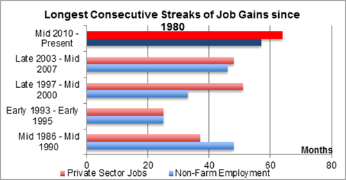
The practice of basing economic stories on the latest data is frequently misleading. Indeed, although it might not sell as many newspapers, trend data are almost always more illuminating and meaningful than the figures from just one month or quarter. And here the longer-term data really do reveal a much different story. June marked 57 consecutive months of gains in non-farm payroll and 64 straight months of private sector job gains — the longest such string since at least WWII. Now some of the prior streaks were interrupted by only a month or two of trivial employment declines; measured by moving two-month averages, the current streak has a long way to go before hitting a record. Still, the current streak shows no sign of abating, and every successive monthly gain should be acknowledged and applauded — and yet is routinely ignored by the press.
The recent job growth also has been remarkably consistent. As measured by the standard deviation of monthly percentage job growth, the current streak has among the lowest volatility averages on record. Thus, what it perhaps lacks in absolute magnitude is at least partially compensated by the constancy of the gains. Such consistency is positive for business planning and investment decisions, and thus ultimately benefits the economy and financial markets.
There are many considerations in assessing the strength of economic conditions. I’ve only touched on a few key employment indicators here and could cite others equally important for a more complete picture. For example, the number of jobs is now above the prior peak though many are part-time and/or are in low-paying occupations. As I’ve said in previous blog posts and other writings, this is by no means a perfect recovery — not least because too many workers and households are not sharing fully in the fruits of our economic growth. And the overall pace of economic growth in this recovery has been “disappointing” by historical norms. But a “disappointing” June employment report? Perhaps, only if you’re looking for bad news. The weight of evidence suggests at least a moderately strong employment picture that is poised to continue for some time yet.

 Colliers Insights Team

 Michael Bate
 Coy Davidson
